


In today's digital world, where communication is largely driven by emails, the small yet significant design elements we interact with daily often go u
In today’s digital world, where communication is largely driven by emails, the small yet significant design elements we interact with daily often go unnoticed. One such element is the mail aesthetic icon—the humble envelope symbol or notification badge that represents an email or message. Though it may appear insignificant at first glance, the mail icon holds an important place in both digital communication and user interface (UI) design.
As the digital landscape evolves, there’s a growing trend toward making even the simplest icons more appealing and aligned with brand identities. This is where the concept of “mail aesthetic icon” comes in—a harmonious blend of usability, design, and emotion that elevates the user experience.
What is a Mail Aesthetic Icon?
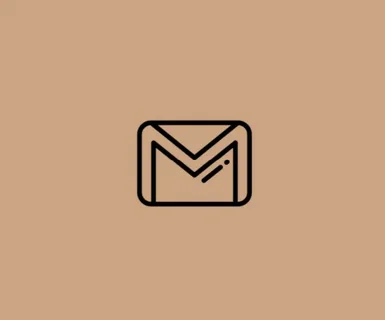
A mail aesthetic icon is a stylized representation of an email or messaging system, often used in apps, websites, and user interfaces. Unlike standard envelope icons, an aesthetic version is created with attention to design elements such as color, form, texture, and thematic expression. It could appear vintage, minimalistic, vibrant, 3D, hand-drawn, or animated.
The icon may be designed to reflect the overall branding of an application or to provide users with a more engaging and intuitive experience. It goes beyond mere functionality—it communicates mood, identity, and intent.
Evolution of Mail Icons
1. Early Digital Days
In the early 2000s, mail icons were purely functional. A basic envelope symbol, often in grayscale or blue, would suffice. These icons were pixelated, boxy, and lacked personality. The priority then was clarity over design.
2. Mobile App Boom
As smartphones became widespread, app developers started paying attention to icons. App stores required icons that were attractive and representative of app functions. This was when the mail icon began to take different shapes—rounded edges, gradients, and even realistic 3D effects.
3. Rise of Flat and Material Design
With the advent of flat design and Google’s Material Design, the trend shifted toward simplicity and minimalism. Mail icons became cleaner, often using bold colors, flat lines, and sharp contrasts.
4. Aesthetic-Centric Design Era
In recent years, design aesthetics have become central to brand identity. Icons now reflect broader themes: pastel palettes, retro vibes, dark modes, and soft gradients. The mail icon isn’t just a button—it’s an integral part of how users perceive an app or website.
Why Do Aesthetic Icons Matter?
Even though icons are small, they are incredibly influential in user interaction. A well-designed mail aesthetic icon offers several benefits:
1. Visual Appeal
An aesthetically pleasing icon enhances the overall look of a digital interface. It attracts users and contributes to a more cohesive design.
2. Brand Alignment
Icons can reflect the values and personality of a brand. A fun, cartoonish mail icon might suit a creative app, while a sleek, minimalist one fits a professional tool.
3. Better UX (User Experience)
Well-crafted icons improve usability. A mail icon that’s too abstract or cluttered can confuse users, while an aesthetic yet clear design ensures better interaction.
4. Emotional Connection
Design triggers emotions. A nostalgic or cute mail icon can evoke a sense of comfort or delight, encouraging more frequent use of the app or service.
Design Elements of a Mail Aesthetic Icon
Creating an effective mail aesthetic icon involves balancing beauty with functionality. Here are some key design elements:
1. Color Palette
Colors convey mood. Soft pastels suggest calmness, while bold primary colors evoke energy. The color scheme must also ensure contrast and visibility, especially in dark or light modes.
2. Shape and Form
Traditional mail icons use the envelope shape. Designers may add rounded corners, drop shadows, or outlines to give depth or softness to the form.
3. Style Consistency
Icons should align with the overall UI style. A skeuomorphic mail icon might feel out of place in a flat design interface. Cohesion is key.
4. Animation and Interaction
Subtle animations, like a fluttering envelope or bouncing notification dot, can bring icons to life. However, they should not be distracting.
5. Clarity and Recognition
No matter how artistic the icon is, it should still instantly communicate its function—sending, receiving, or composing mail.
Popular Styles for Mail Aesthetic Icons
Different aesthetics appeal to different user groups. Here are some popular themes:
1. Minimalist
Using flat shapes, limited colors, and clean lines, minimalist icons focus on simplicity. Ideal for modern, professional interfaces.
2. Retro/Vintage
Inspired by old-school postboxes or handwritten letters, this style appeals to those who love nostalgia and unique character.
3. Pastel/Soft UI
Characterized by gentle colors and rounded forms, pastel mail icons are trendy in lifestyle, wellness, and creative apps.
4. Neon/Dark Mode
Bold neon lines on dark backgrounds create high contrast, making them popular for futuristic or tech-savvy platforms.
5. Hand-Drawn/Doodle
These icons have a personal, whimsical touch. Great for creative tools, kids’ platforms, or boutique brands.
Where Mail Aesthetic Icons Are Used
1. Email Applications
From Gmail to ProtonMail, email apps often experiment with their mail icons, especially for mobile app branding.
2. Social Media Platforms
Apps like Facebook, Instagram, and LinkedIn use mail-style icons for message or notification indicators.
3. Portfolio and Personal Websites
Designers and creatives often use custom icons to match their portfolio themes, including customized mail icons for contact sections.
4. Mobile App Interfaces
In both iOS and Android environments, mail icons appear in home screens, toolbars, and widgets—making their appearance significant.
5. Desktop UI/UX Systems
Operating systems like Windows, macOS, and Linux also include mail icons in system trays and email clients.
Design Tips for Creating a Mail Aesthetic Icon
If you’re designing a custom mail icon, here are a few best practices:
- Sketch first: Begin with rough drafts before finalizing on software.
- Use design tools like Figma, Adobe Illustrator, or Sketch.
- Test in context: Check how the icon looks in light and dark modes.
- Keep it scalable: Icons should be legible at various sizes, from 16×16 px to 512×512 px.
- Maintain consistency: If you have a full icon set, make sure the mail icon follows the same visual language.
The Psychology Behind Icon Design
Every icon tells a story. The envelope symbol for mail is a universal metaphor rooted in physical communication. By reinterpreting it aesthetically, designers can tap into users’ memories, expectations, and preferences. A soft pink envelope might evoke feelings of warmth and care, while a sleek black-and-white version could signal professionalism.
Aesthetic icons act as visual shorthand—they reduce cognitive load, guide the user’s eye, and make digital navigation more intuitive.
Frequently Asked Questions (FAQs)
Q1: What makes an icon “aesthetic”?
An aesthetic icon is one that goes beyond basic functionality. It’s designed with attention to visual style, emotional impact, and brand identity. It may incorporate trends such as minimalism, pastel colors, hand-drawn elements, or animations.
Q2: Can a mail icon be both functional and aesthetic?
Absolutely. The best icons are both. They are easily recognizable and communicate their purpose clearly, while also being visually appealing and aligned with the overall design of the platform.
Q3: Are animated mail icons useful or distracting?
When done subtly, animations can enhance user experience by making interactions more delightful. However, overly flashy or fast-moving animations can be distracting and should be used sparingly.
Q4: How can I create my own aesthetic mail icon?
You can use design tools like Figma, Canva, Adobe Illustrator, or even Procreate for hand-drawn styles. Start with a concept (theme, color palette, style), sketch ideas, and iterate. Ensure your final design is clear, scalable, and aligned with your brand.
Q5: Do aesthetic icons improve app engagement?
While aesthetic icons alone won’t guarantee higher engagement, they contribute to a cohesive and enjoyable user interface, which can improve user satisfaction and retention over time.
Q6: What are some trends in mail icon design for 2025?
Current trends include:
- Soft UI and glassmorphism
- Animated micro-interactions
- Vibrant neon-on-dark modes
- 3D rendered icons with shadows
- Monoline and minimal line art
Q7: Can I use aesthetic icons from icon packs in commercial projects?
Yes, but always check the licensing. Some icon packs are free for commercial use, while others require attribution or a paid license.
Conclusion
The mail aesthetic icon may be small, but it plays a big role in shaping the way users interact with digital products. Whether you’re a designer, developer, or brand strategist, paying attention to this tiny symbol can enhance the visual harmony and emotional connection of your interface. With thoughtful design, the humble envelope becomes a powerful communicator of function, style, and brand story.
Must Visit: spotlightlive
COMMENTS